As we approach a new decade, we look back at one of the biggest years for design. Digital trends in social media and websites have made huge impacts, street art has transformed into experiential design and brands are breaking the typography no-no’s and creating something unique to only them. Buie & Co.’s creative team worked on a variety of projects this year, but wanted to share a few of our favorites that highlight the top trends we used in our work:
- Custom typefaces;
- Brand-specific illustrations; and
- Abstract shapes
Custom Typefaces
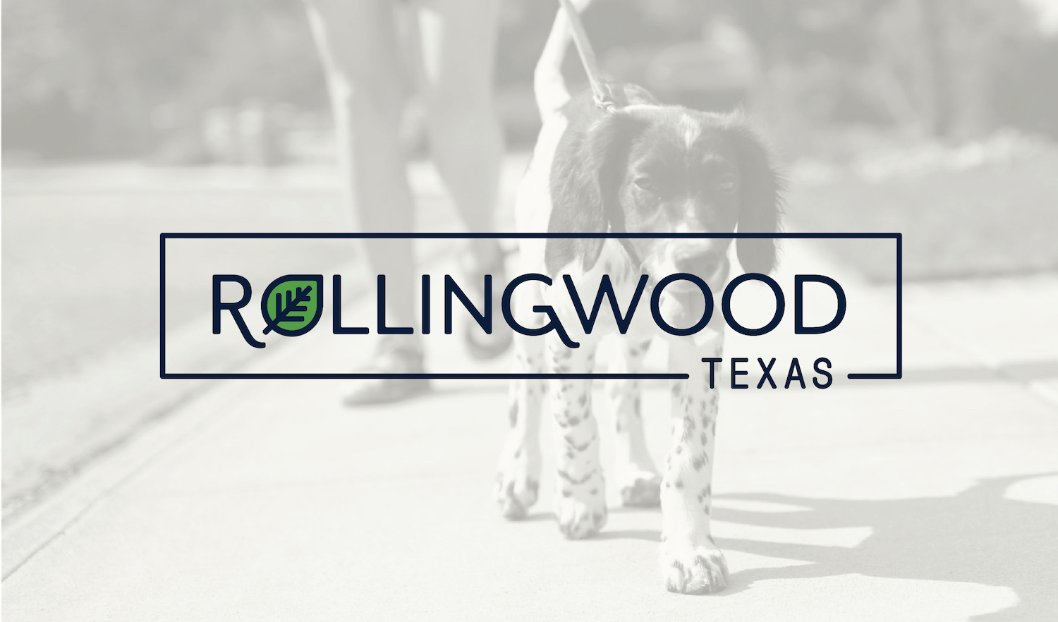
All of the top brands are designing custom typefaces for their updated logos (such as Google, Netflix, AirBnB, Apple, YouTube, etc.) In January 2019, Buie & Co. unveiled the City of Rollingwood’s new brand identity with a custom typeface for the logo. The sans serif font was softened with curves and arches reminiscent of the rolling hills throughout the city. Check out the full brand standards and read more about the project in our portfolio.

Custom Made Illustrations & Icons
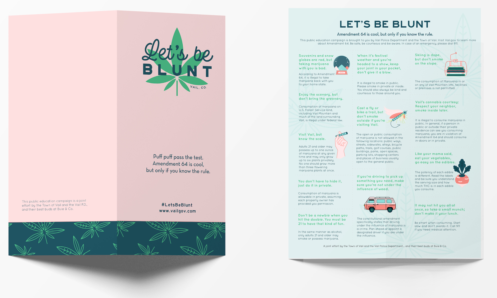
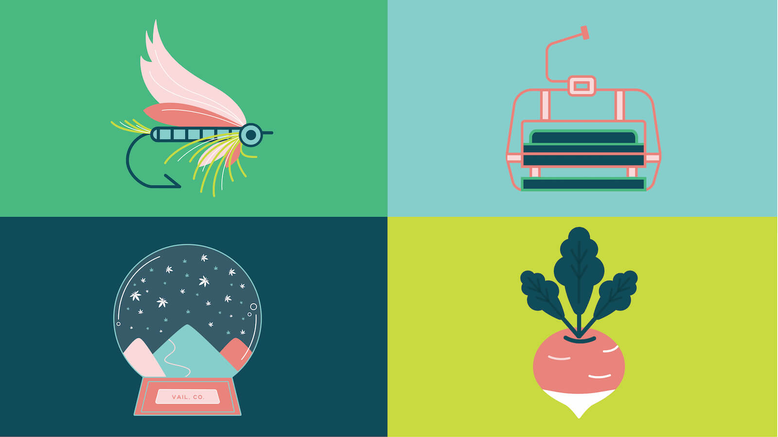
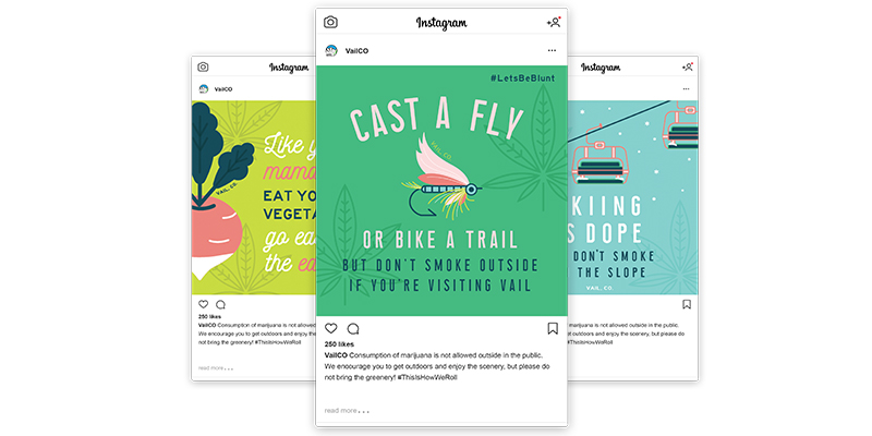
Behance noted that “According to recent statistics custom made illustrations can convert 7 times better than any stock photography.” Custom illustrations and icons can almost immediately inform an audience of the subject of a piece of collateral and communicate what the brand is all about. In the summer of 2019, we worked with the Town of Vail and its police department to launch an education campaign on around safe marijuana usage. As you can imagine, this was a dope project ;)! We incorporated various custom illustrations and paired them with cheeky taglines. Check out some of our favorites below or visit the full case study to learn more.
Source: https://www.behance.net/gallery/71481981/2019-Design-Trends-Guide
Abstract Shapes
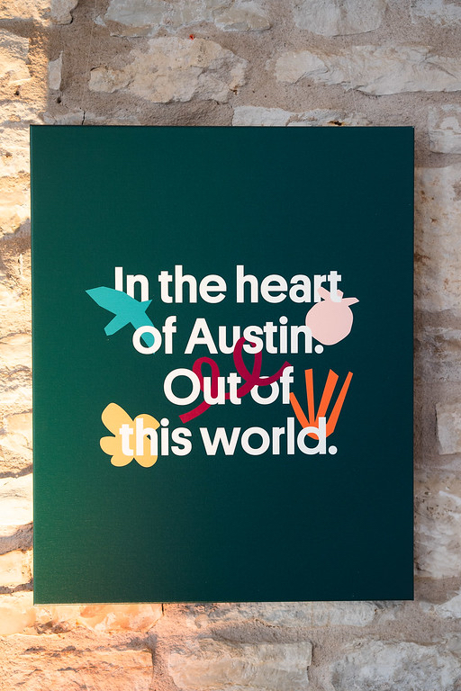
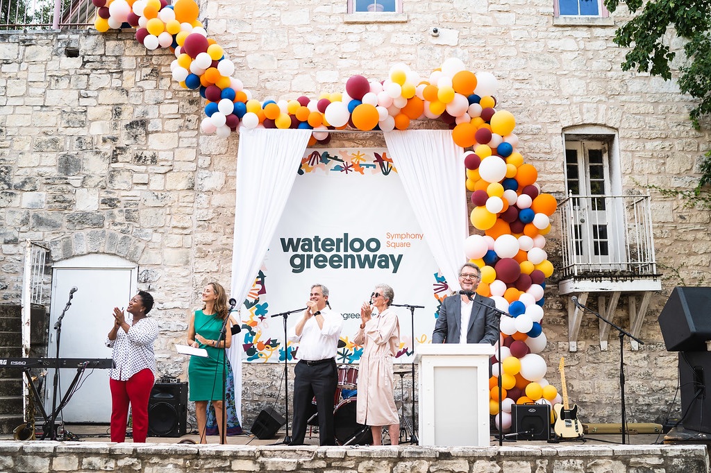
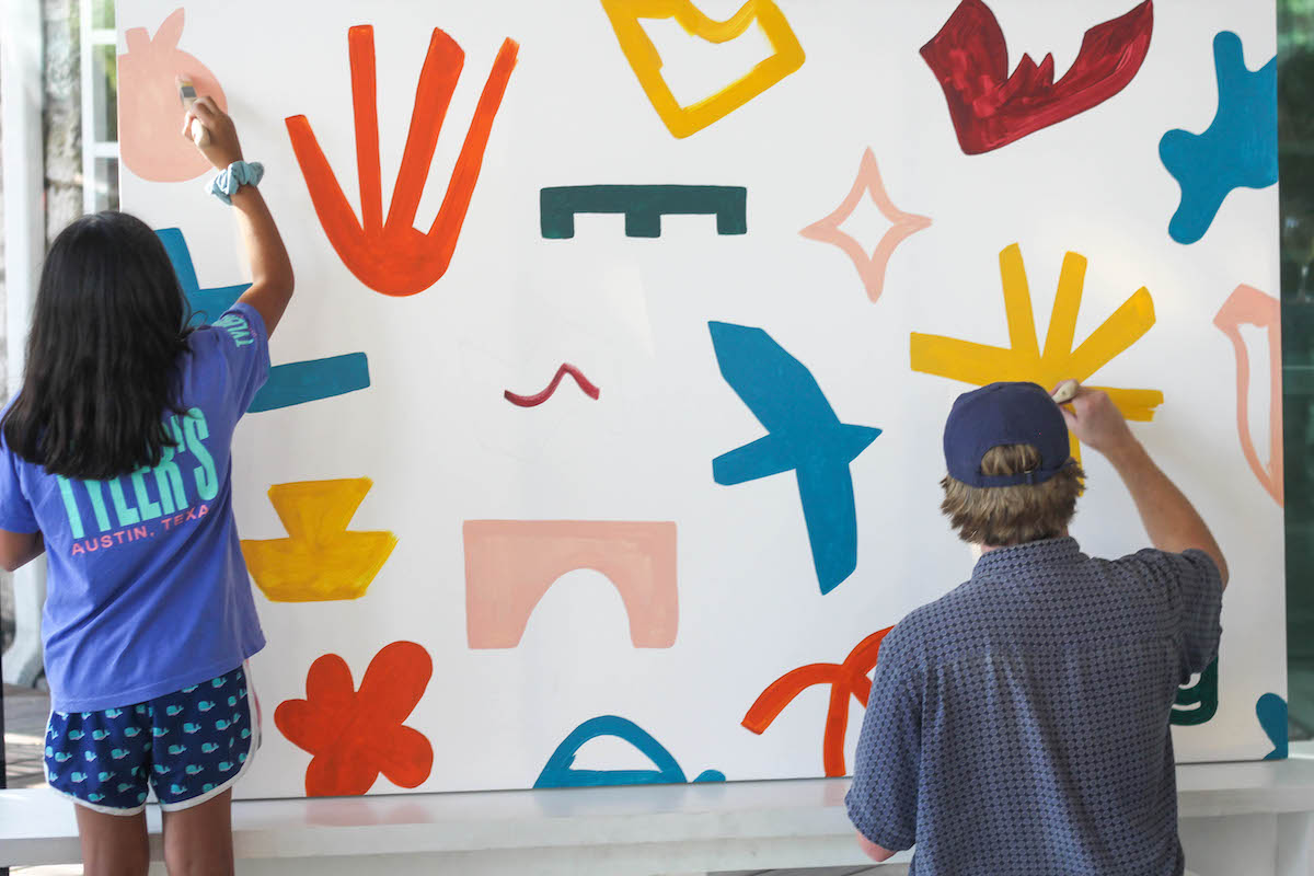
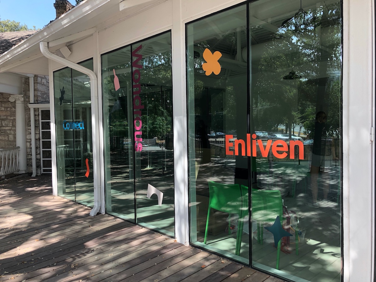
Abstract shapes aren’t limited to the fine art pieces you see in galleries, they can create a sense of playfulness that is unique to a brand. Using abstract shapes can also create balance when used with other design elements like, typography. In the Fall of 2019, Waller Creek Conservancy rebranded as Waterloo Greenway. We had so much bringing this new brand to life! Check out how we applied it to their environment for their brand reveal event and launch party. From balloon sculptures and window decals to a brand gallery and even a commissioned immersive piece of public art, every shape was used intentionally to harmonize the whole composition of the event. To say we had a blast planning and implementing this event would be an understatement. Check out a few of our favorite photos below, and visit the full case study to learn more.
While these are just a few of our favorite projects and trends of 2019, Buie & Co. used many of the top design trends of 2019 in other projects throughout the year. Check out our full portfolio to see what we’ve been up to and continue to follow us to see what we’ll be playing with in 2020.
Cheers to the next decade of design!
